
Project 1

Exploratory Data Analysis (EDA)

Problem Statement
Your hometown mayor just created a new data analysis team to give policy advice, and the administration recruited you via LinkedIn to join it. Unfortunately, due to budget constraints, for now the “team” is just you…
The mayor wants to start a new initiative to move the needle on one of two separate issues: high school education outcomes, or drug abuse in the community.
Also unfortunately, that is the entirety of what you’ve been told. And the mayor just went on a lobbyist-funded fact-finding trip in the Bahamas. In the meantime, you got your hands on two national datasets: one on SAT scores by state, and one on drug use by age. Start exploring these to look for useful patterns and possible hypotheses!
Exploratory Data Analysis
This project is focused on exploratory data analysis, aka “EDA”. EDA is an essential part of the data science analysis pipeline. Using packages such as numpy, pandas, matplotlib and seaborn, data scientists are equipped with an array of tools to visualise data. EDA and visualisation serves as a starting point to analyse any dataset (refer to flow chart below).

Source: Transformation - Building a Data Science Capability
https://www.linkedin.com/pulse/transforamtion-building-data-science-capability-simon-jones
 1. Load the
 sat_scores.csv dataset and describe it
1.1 Describing dataset using pandas .describe() and .info()
print datasat.info()
datasat.head()
<class 'pandas.core.frame.DataFrame'>
RangeIndex: 52 entries, 0 to 51
Data columns (total 4 columns):
State     52 non-null object
Rate      52 non-null int64
Verbal    52 non-null int64
Math      52 non-null int64
dtypes: int64(3), object(1)
memory usage: 1.7+ KB
None
| State | Rate | Verbal | Math | |
|---|---|---|---|---|
| 0 | CT | 82 | 509 | 510 |
| 1 | NJ | 81 | 499 | 513 |
| 2 | MA | 79 | 511 | 515 |
| 3 | NY | 77 | 495 | 505 |
| 4 | NH | 72 | 520 | 516 |
datasat.describe()
| Rate | Verbal | Math | |
|---|---|---|---|
| count | 52.000000 | 52.000000 | 52.000000 |
| mean | 37.153846 | 532.019231 | 531.500000 |
| std | 27.301788 | 33.236225 | 36.014975 |
| min | 4.000000 | 482.000000 | 439.000000 |
| 25% | 9.000000 | 501.000000 | 504.000000 |
| 50% | 33.500000 | 526.500000 | 521.000000 |
| 75% | 63.500000 | 562.000000 | 555.750000 |
| max | 82.000000 | 593.000000 | 603.000000 |
1.2 Summary
The sat scores contain 4 columns of information :
- State: Refers to states in the U.S.
- Rate: A percentage possibly referring to SAT passing rate of children
- Verbal: Verbal Scores in the range of 482 - 593
- Math: Math Scores in the range of 439 - 603
2. Plot the data using seaborn
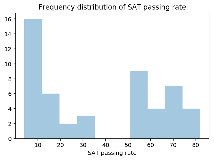
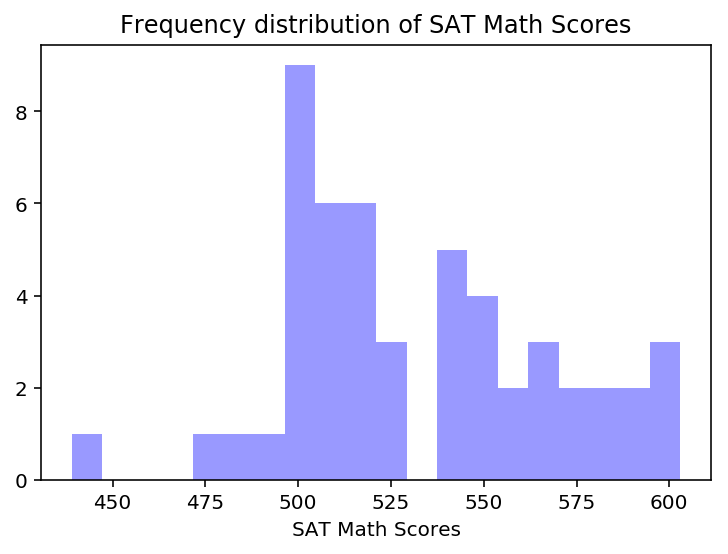
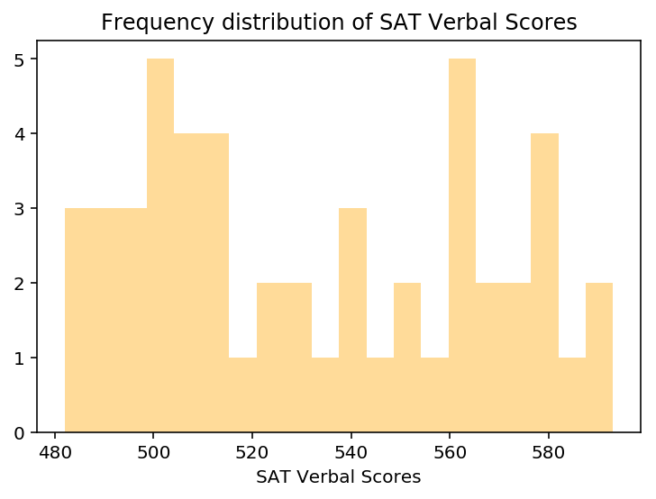
2.1 Using seaborn’s distplot, plot the distributions for each of Rate, Math, and Verbal
# Plot rate distplot

ratep = sns.distplot(datasat['Rate'], kde=False, bins=10)
ratep.set(xlabel='SAT passing rate')
ratep.set_title('Frequency distribution of SAT passing rate')
# Plot math distplot

mathp = sns.distplot(datasat['Math'], kde=False,bins=20, color='blue')
mathp.set(xlabel='SAT Math Scores')
mathp.set_title('Frequency distribution of SAT Math Scores')
# Plot verbal distplot

verbp = sns.distplot(datasat['Verbal'], kde=False,bins=20, color='orange')
verbp.set(xlabel='SAT Verbal Scores')
verbp.set_title('Frequency distribution of SAT Verbal Scores')
2.2 Using seaborn’s pairplot, show the joint distributions for each of Rate, Math, and Verbal
sns.pairplot(datasat, vars=['Rate', 'Math', 'Verbal'], hue='State')
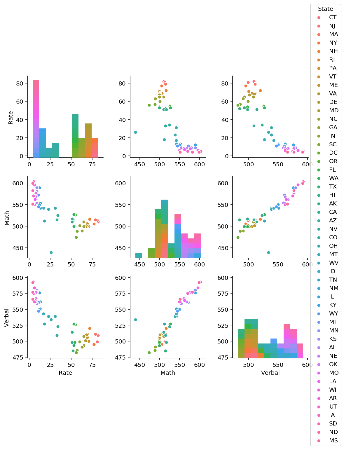
Interpretation of pair plot
1. Rate seems to be negatively correlated with both math and verbal scores.
From plots 2 and 3 in the first row, as scores increase, rate decreases.
2. Math and verbal appears to be positively correlated.
From plots (row 2, plot 3 and row 3, plot 2), as either variable increases, the other seems to increase as well.
3. Adding hue dimension (assigned to state) may yield interesting information about the clustering of states according to SAT scores.
3. Plot the data using built-in pandas functions.
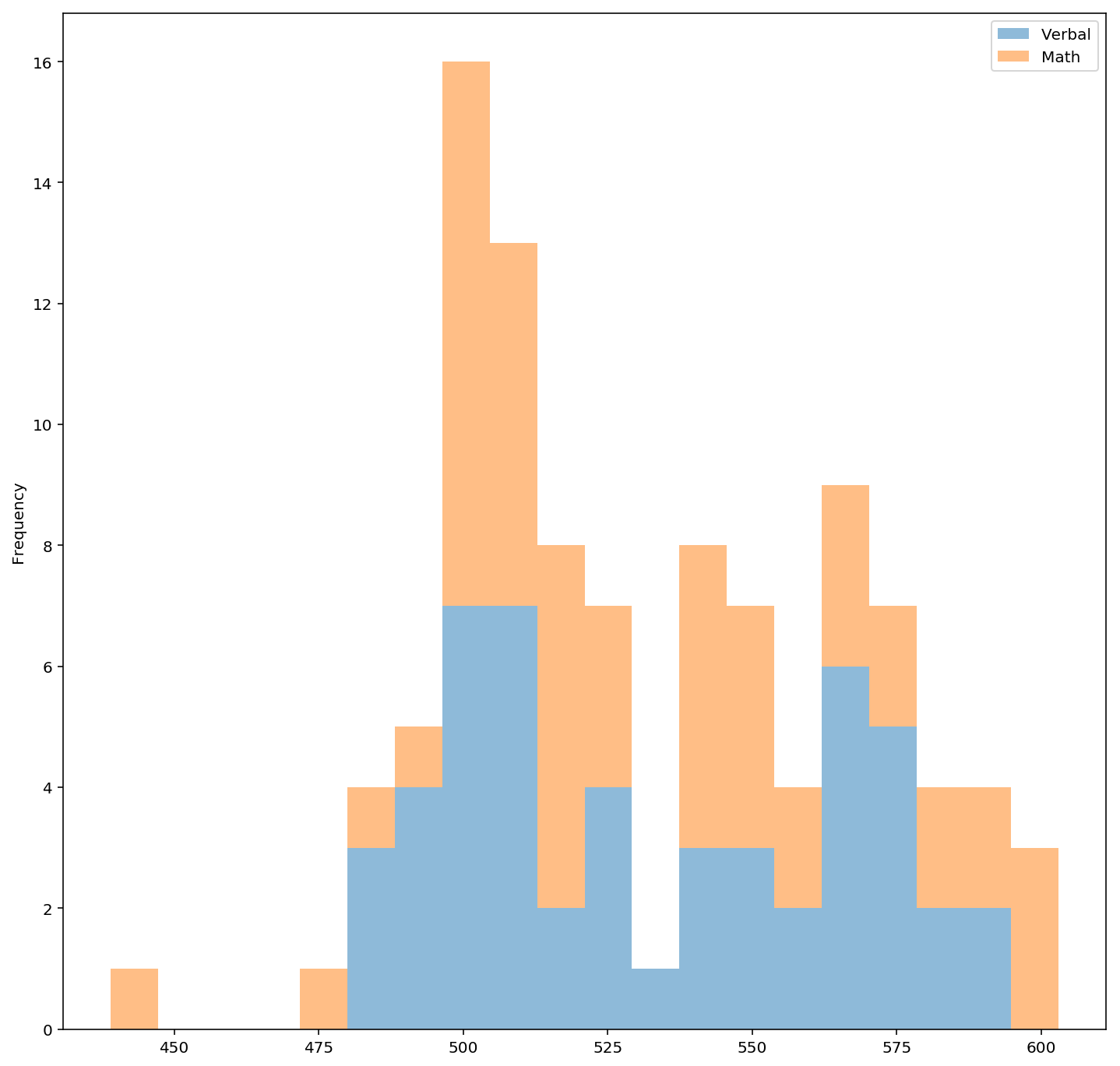
3.1 Plot a stacked histogram with Verbal and Math using pandas
datasat[['Verbal','Math']].plot.hist(stacked=True, alpha=0.5,figsize=(12,12), bins=20)
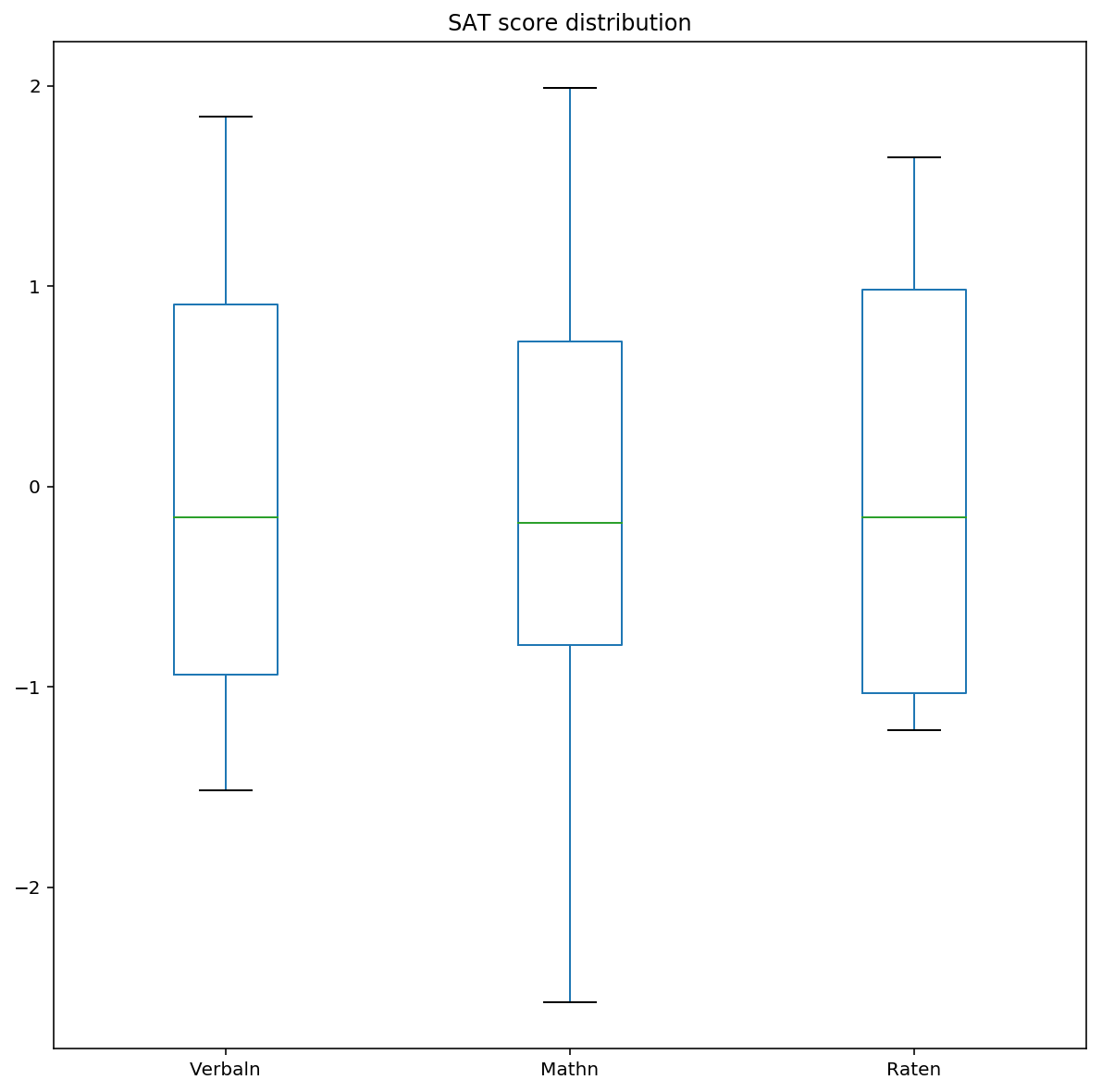
3.2 Plot Verbal , Math and Rate (normalised) on the same chart using boxplots
Normalisation centers each variable so that differences in scale can be visualised.
# divide each feature by its own mean, to normalise all features
datanorm = datasat.copy()
print datanorm.mean()

datanorm['Raten'] = datanorm['Rate'].map(lambda x: (x-37.153846)/np.std(datanorm['Rate']))
datanorm['Verbaln'] = datanorm['Verbal'].map(lambda x: (x-532.019231)/np.std(datanorm['Verbal']))
datanorm['Mathn'] = datanorm['Math'].map(lambda x: (x-531.5)/np.std(datanorm['Math']))
Rate       37.000000
Verbal    532.529412
Math      531.843137
dtype: float64
datanormp = datanorm.sort_values(by=['Verbaln','Mathn']).plot(kind='box', y=['Verbaln','Mathn','Raten'], figsize=(10,10),title='SAT score distribution')
4. Examine summary statistics
Checking the summary statistics! Correlation matrices give a one stop view of how variables are related linearly to each other.
4.1 Create the correlation matrix of your variables (excluding State).
datasat.corr()
| Rate | Verbal | Math | ver_diff | |
|---|---|---|---|---|
| Rate | 1.000000 | -0.888121 | -0.773419 | -0.098671 |
| Verbal | -0.888121 | 1.000000 | 0.899909 | 0.044527 |
| Math | -0.773419 | 0.899909 | 1.000000 | -0.395574 |
| ver_diff | -0.098671 | 0.044527 | -0.395574 | 1.000000 |
Rate seems to have a negative correlation with the verbal and math variables.
Verbal and math seems to be positively correlated.
4.2 Assign and print the covariance matrix for the dataset
- Covariance measures how 2 variables vary together while correlation measures how one variable is dependent on the other.
- Correlation can be obtained by dividing the covariance with the product of standard deviation of the 2 variables.
- Correlation will be able to tell us when a variable increases, whether the other increases or decreases.
datasat.cov()
| Rate | Verbal | Math | ver_diff | |
|---|---|---|---|---|
| Rate | 759.04 | -816.280000 | -773.220000 | -43.060000 |
| Verbal | -816.28 | 1112.934118 | 1089.404706 | 23.529412 |
| Math | -773.22 | 1089.404706 | 1316.774902 | -227.370196 |
| ver_diff | -43.06 | 23.529412 | -227.370196 | 250.899608 |
5. Performing EDA on “drug use by age” data.
5.1 EDA involves the cleaning of data, checking for null values, data types etc.
df1 = pd.read_csv(drugcsv)

df1.head(1)
df1.isnull().sum()
age                        0
n                          0
alcohol-use                0
alcohol-frequency          0
marijuana-use              0
marijuana-frequency        0
cocaine-use                0
cocaine-frequency          0
crack-use                  0
crack-frequency            0
heroin-use                 0
heroin-frequency           0
hallucinogen-use           0
hallucinogen-frequency     0
inhalant-use               0
inhalant-frequency         0
pain-reliever-use          0
pain-reliever-frequency    0
oxycontin-use              0
oxycontin-frequency        0
tranquilizer-use           0
tranquilizer-frequency     0
stimulant-use              0
stimulant-frequency        0
meth-use                   0
meth-frequency             0
sedative-use               0
sedative-frequency         0
dtype: int64
df1.info()
<class 'pandas.core.frame.DataFrame'>
RangeIndex: 17 entries, 0 to 16
Data columns (total 28 columns):
age                        17 non-null object
n                          17 non-null int64
alcohol-use                17 non-null float64
alcohol-frequency          17 non-null float64
marijuana-use              17 non-null float64
marijuana-frequency        17 non-null float64
cocaine-use                17 non-null float64
cocaine-frequency          17 non-null object
crack-use                  17 non-null float64
crack-frequency            17 non-null object
heroin-use                 17 non-null float64
heroin-frequency           17 non-null object
hallucinogen-use           17 non-null float64
hallucinogen-frequency     17 non-null float64
inhalant-use               17 non-null float64
inhalant-frequency         17 non-null object
pain-reliever-use          17 non-null float64
pain-reliever-frequency    17 non-null float64
oxycontin-use              17 non-null float64
oxycontin-frequency        17 non-null object
tranquilizer-use           17 non-null float64
tranquilizer-frequency     17 non-null float64
stimulant-use              17 non-null float64
stimulant-frequency        17 non-null float64
meth-use                   17 non-null float64
meth-frequency             17 non-null object
sedative-use               17 non-null float64
sedative-frequency         17 non-null float64
dtypes: float64(20), int64(1), object(7)
memory usage: 3.8+ KB
5.2 EDA also involves looking at an overview of the dataset (descriptive statistics like mean and standard deviation)
pd.options.display.max_columns = 999
df1.describe(include='all')
df2 = df1.iloc[:,[2,4,6,8,10,12,14,16,18,20,22,24,26]] # Split df1 into use columns
df3 = df1.iloc[:,[3,5,7,9,11,13,15,17,19,21,23,25,27]] # Split df1 into freq columns
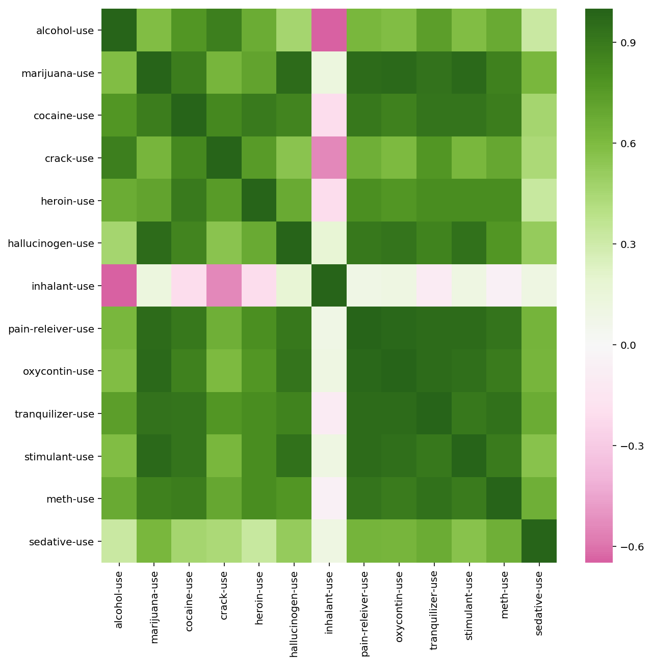
matplotlib.pyplot.figure(figsize=(10,10))
sns.heatmap(df2.corr(), cmap="PiYG", center=0)
# Heatmap showing use correlations
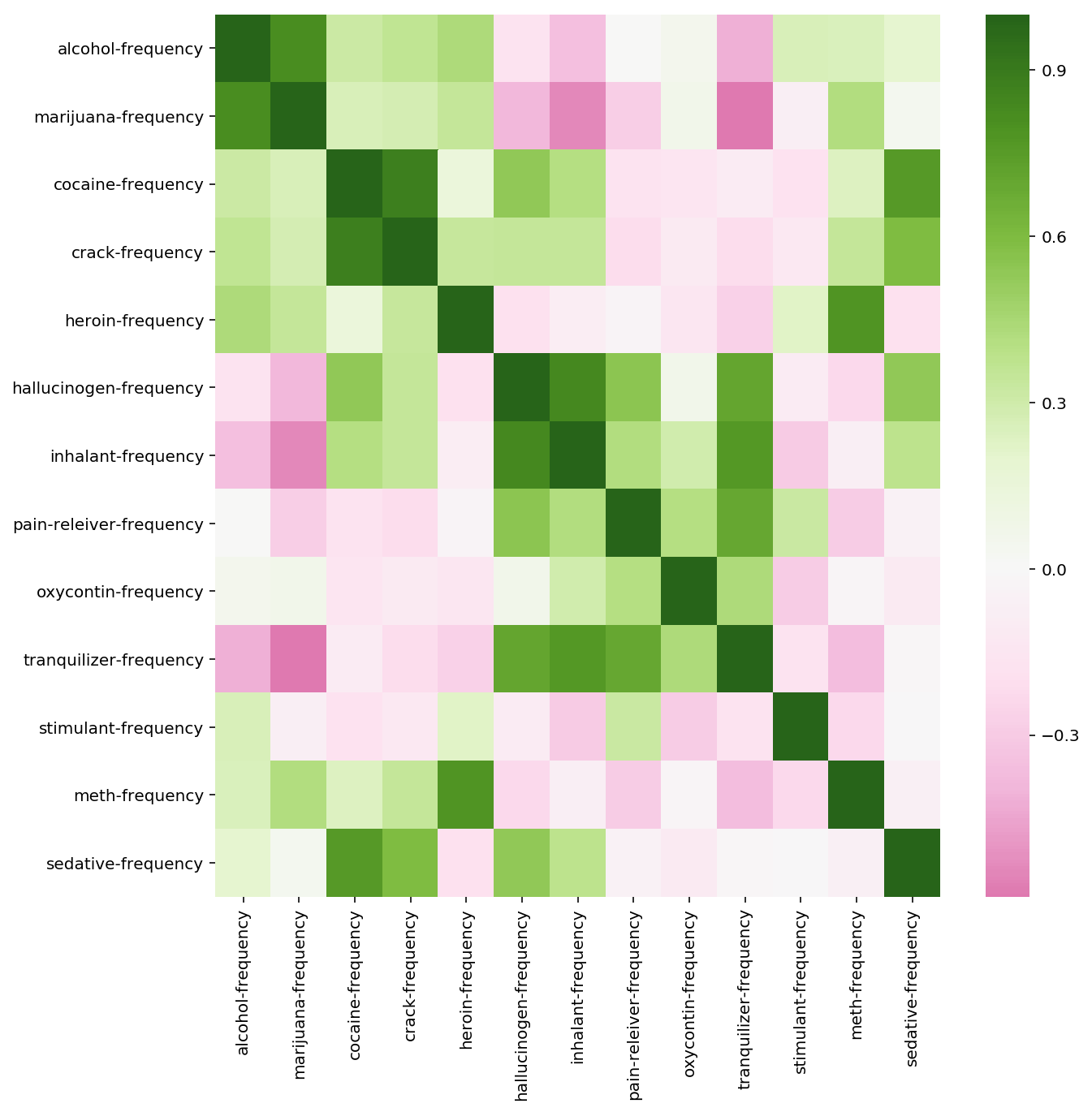
matplotlib.pyplot.figure(figsize=(10,10))
sns.heatmap(df3.corr(), cmap="PiYG", center=0)
# Plotting drug use across age
f, ax = plt.subplots(figsize=(15, 15))

x = df1['age']

for col in df2.columns:
    y = df2[col]
    plt.plot(x, y)

f.suptitle('Drug use across age',fontsize = 20)
f.legend()
plt.xlabel('age')
plt.ylabel('usage')
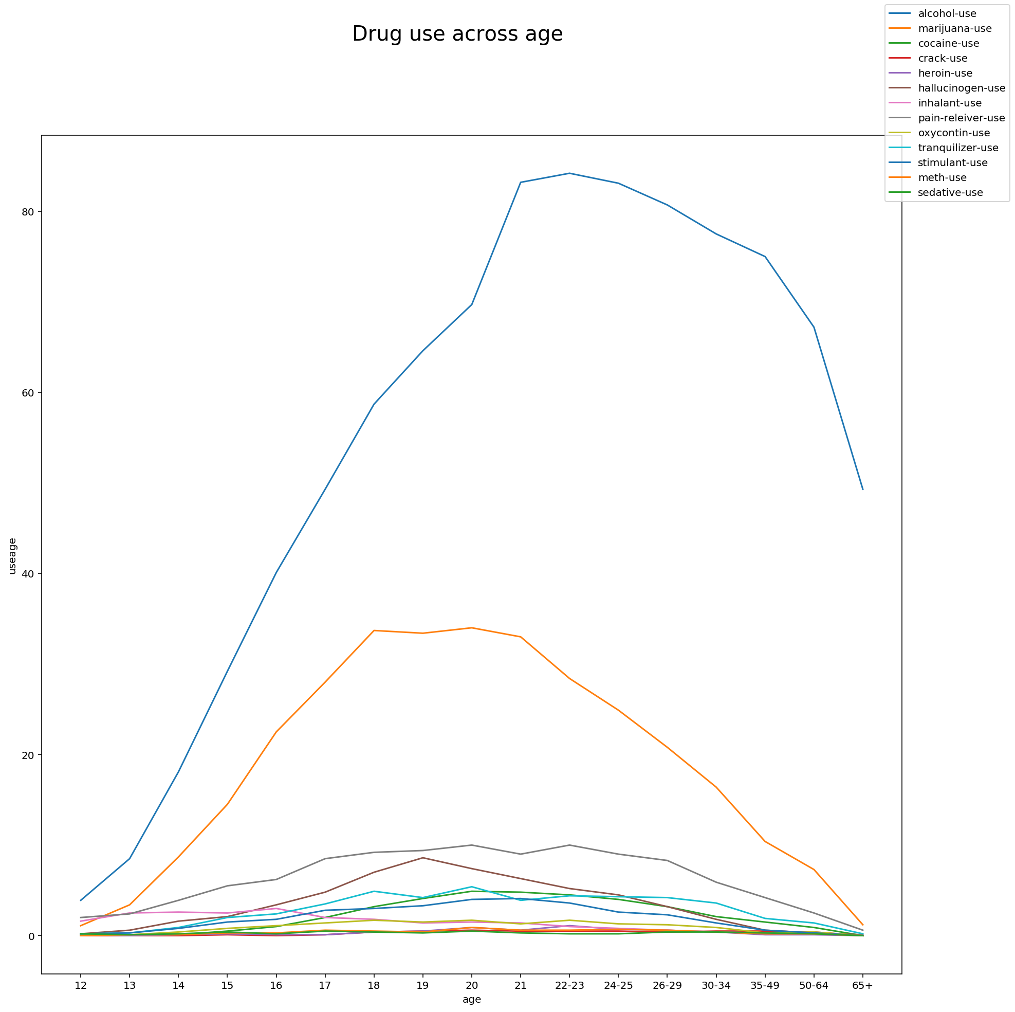
Observations:
The predominant drugs that are used across all age groups are the following:
- Alcohol
- Marijuana
- Cocaine
# Plotting drug use frequency across age
f, ax = plt.subplots(figsize=(15, 15))

x = df1['age']

for col in df3.columns:
    y = df3[col]
    plt.plot(x, y)

f.suptitle('Drug frequency across age',fontsize = 20)
f.legend()
plt.xlabel('age')
plt.ylabel('frequency')
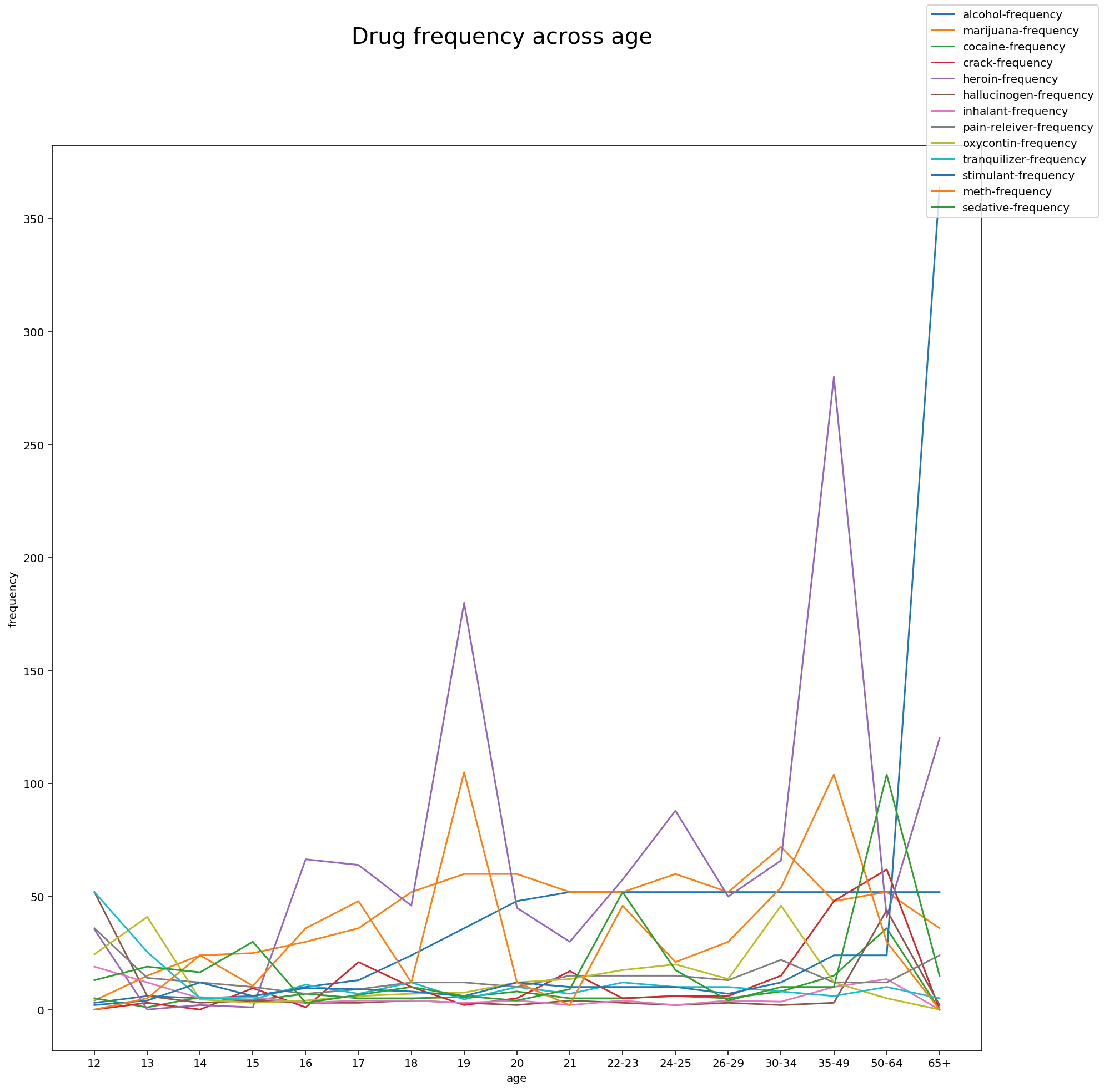
Observations:
Frequency of drug use does not follow a pattern but interestingly there are spikes in certain ages where frequency of a drug use is high.
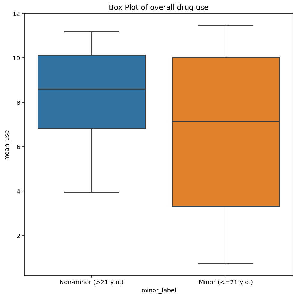
5.3 Create a testable hypothesis about this data
Test statistics like t-test may yield simple observations about the data. In this case, t test revealed that mean overall drug use for adolescents is not statistically different from mean drug use of non-adolescents.
# perform t test
# Let null hypothesis be: The mean overall drug use for adolescents is equals to the mean overall drug use for non-adolescents

list1 = df2['mean_use'].tolist()
list2 = list1[-7:]
list3 = list1[0:10]

stats.ttest_ind(list3, list2)
Ttest_indResult(statistic=-0.94213218959786749, pvalue=0.36105217344934259)
# Visualisation of values using box plot
plt.subplots(figsize=(8,8))
ax = sns.boxplot(x='minor_label', y='mean_use', data=df2)
ax.set(xticklabels=['Non-minor (>21 y.o.)', 'Minor (<=21 y.o.)'], title='Box Plot of overall drug use')
6. Introduction to dealing with outliers
Rate does not seem to have outliers since it is a percentage range and most values fall between 1 to 100.
Definition of outlier:
An outlier is defined to be a value that is 1.5x interquartile range away from the first or third quartile.
sns.boxplot(data=datasat)
# box plot shows that only ver_diff has outliers
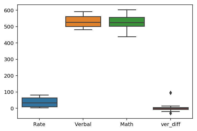
# Function to calculate +/- 1.5 IQR range for outliers , ie, values that fall beyond this range will be considered outliers
def iqr(series):
    q1 = datasat[series].quantile(0.25)
    q3 = datasat[series].quantile(0.75)
    iqr = q3 - q1
    out_range = [q1-1.5*iqr, q3+1.5*iqr]
    return out_range
print 'outlier range for \'Rate\' is :', iqr('Rate')
print 'outlier range for \'Verbal\' is :', iqr('Verbal')
print 'outlier range for \'Math\' is :', iqr('Math')
print 'outlier range for \'ver_diff\' is :', iqr('ver_diff')
outlier range for 'Rate' is : [-73.5, 146.5]
outlier range for 'Verbal' is : [409.5, 653.5]
outlier range for 'Math' is : [421.25, 639.25]
outlier range for 'ver_diff' is : [-21.75, 20.25]
Observations:
Since the 3 main columns (rate, verbal and math) fall within the outlier range of values, there are no outliers in these columns.
For the ver_diff column, which is a difference in verbal and math scores, outliers may arise if the difference in the 2 columns is large. Thus, it will not be useful to remove the outliers in this column since this measures a difference, which may be a feature we might be interested in.